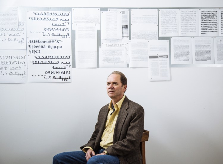
Until recently, if members of the Cherokee Nation wanted to send a text message in their traditional language, they could do so only with a typeface that just partially captured their language. Now, they can send that text with all the nuance of the Cherokee language, expressed in looping, gestural glyphs that more closely resemble small drawings or doodles than letters from a Latin-based alphabet.
Mark Jamra is the reason why. The type designer from Portland is helping the Cherokee Nation adapt a writing system based on centuries-old traditions for the digital age.
Jamra, 59, is celebrated in the world of type and design as an innovator. Classically trained and considered a master by his peers, he has received national and international awards for his lettering and typefaces. But nothing matches the satisfaction of knowing he’s helped preserve a culture and advance a language, he said.
“People are always trying to build their cathedral, that thing that outlives them,” Jamra said. “I wanted something that would outlast me.”
Jamra’s cathedral is Phoreus Cherokee, a typeface family that he began circulating over the past year. This is not just another pretty typeface, one among dozens that Jamra has designed in a career of more than 30 years. This one, he hopes, helps restore cultural identity among people who lost it in their assimilation into Anglo-American society.
Jamra’s work modernizes a writing system developed by the Cherokee silversmith Sequoyah in 1820. Sequoyah’s system was widely used among the Cherokee and was the principal tool for recording recipes, writing letters and preserving folklore for more than a century. Over time, as Cherokee Indians folded Anglo culture into their own, English replaced Cherokee as their primary language, both spoken and written.
Previous efforts to update the writing system have been spotty, said Roy Boney Jr., a Cherokee who manages the language program of the Cherokee Nation Education Services Group in Tahlequah, Oklahoma, where the tribe is based.
As many as 10,000 people speak Cherokee, Boney said. Fewer write it. That’s in part because efforts to adapt Sequoyah’s symbols for digital use have been less than satisfactory, said Boney.
“Before Mark, there were a handful of fonts that existed, but many of the glyphs weren’t accurate or were completely wrong,” he said. “Mark created a font that represented those symbols accurately and authentically.”
He created a cleaner set of characters in a variety of weights that ranged from light to bold. Today, Jamra’s efforts are a part of the Cherokee’s push to make the language available across digital applications, including Apple devices and Android phones. There are Cherokee interfaces for Microsoft Windows and Google, as well.
Jamra’s work fits into a much larger picture of Cherokee culture, Boney said. The tribe’s writing system has been in continuous use since the 1820s, and adapted for every major form of print technology, starting with the printing press in the late 19th century to several models of typewriters in the early 20th century, word processing in the 1980s and computer fonts in the 21st century.
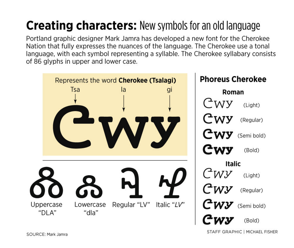
In addition to being the latest, Jamra’s font is the most inclusive, the first commercially available Cherokee font, and the first to include italics and lower- and uppercases. The Cherokee language consisted of one set of symbols, all uppercase. Jamra also brought back a historical character that was dropped over time, Boney said.
Phoreus – A typeface family for the Cherokee language from Dean Merrill on Vimeo.
Using historical documents as a guide, Jamra created a syllabary based on Sequoyah’s early efforts. A syllabary is a set of symbols that represent syllables, unlike an alphabet, which consists of individual letters. The Cherokee syllabary consists of 86 symbols, or glyphs. Some of the symbols resemble English-language letters, but do not sound like English.
Jamra became interested in the Cherokee syllabary when he attended an international type conference in New Orleans in the summer of 2011. A Cherokee contingent made a presentation, appealing for functional typefaces to help preserve its written culture.
STRADDLING ART, TECHNOLOGY
Jamra sensed an opportunity to work in an area where little work had been done. Type design is a crowded camp, as technology has democratized the field. After three decades in the business, Jamra wanted a new challenge that would distinguish his work. The Cherokee project presented challenges that straddled art and technology. He learned Cherokee history and culture, and he became familiar with a foreign language and writing system. “It was the search for more meaning in my work, having done extensive artistic investigations into the Latin script,” he said.
Jamra began with the historical version of the language, then asked Boney and his team if he could design a version in italics, which were implemented in 2014. That allowed him to create an artful typeface that was completely new and reflected some of the forms and niceties of handwriting. He found decades of manuscripts that showed a cursive form in handwriting, but never an actual typeface that provided the Cherokees with the expressive and semantic properties of an italic type.
To develop lowercase glyphs, he studied historical documents and noticed that sentences frequently began with a large syllable, then continued with smaller versions of single-case glyphs – one large cap, followed by a sentence of small caps. That portion of the project was completed this fall.
Jamra designs by hand and directly on the computer. He prefers drawing letters and glyphs by hand, and always has. He scans hand-drawn letters into the computer and renders them in a font-production program. As the project progresses, the work becomes more exclusively computer-based. The final weeks of production, when the glyphs have been drawn and perfected, involve coding and font metrics, all of which are done on the computer.
The trace of the human hand is visible in Phoreus Cherokee, which Jamra attributes to his early drawings and his calligraphy practice.
“I have no interest in creating dead forms,” he said. “I prefer living forms, something that shows the human spirit, however subtly.”
He chose the name Phoreus because he liked the way it sounded and what the word suggested. Phoreus means “carrier” or “bearer” in ancient and modern Greek. “Could there be a better name for a typeface? I think I got lucky with that one,” he said. “True, it’s not a Cherokee word, but that’s OK.”
INSISTENCE ON PERFECTION
Jamra teaches graphic design at the Maine College of Art in Portland and operates the Portland studio Jamra Patel with his business partner, Neil Patel. They work in a small, sparsely appointed office in the Bakery Studios on Pleasant Street. From there, Jamra manages TypeCulture, an online retail business that he began in 2004 and where he licenses the typefaces he’s designed, including Phoreus Cherokee.
Right now, Jamra and Patel are adapting the West African writing system known as N’ko for digital applications.
Jamra moved to Portland in 1995 to teach at MECA, where he is an associate professor. He grew up in Ohio and studied graphic design at Kent State University before moving overseas to do his graduate work at Basel School of Design in Switzerland.
There, “I learned to love type because of the permanence of it,” he said. “I didn’t want to do something that was fleeting.”
He stayed in Europe, teaching in Germany for 12 years, until MECA recruited him.
His training and his insistence on perfection separate Jamra from his peers, said typography columnist and educator Ilene Strizver, who lives in Connecticut. Jamra leaned the traditions of type design from masters in Switzerland and has achieved master status himself because of his high standards, she said.
“Most type designers actually are self-taught or don’t have much training,” she said. “Mark’s got this amazing training, and because he’s an academic, he’s interested in more than just, ‘Let’s pop out another font.’ When Mark started, the only people doing it were people interested and committed. Today, every other person is popping out a new font over the long weekend.”
Jamra estimated it takes him anywhere from two to seven years to design a multiweight, multistyle typeface family.
Maine book publisher, writer and artist Tim McCreight was on the MECA search committee that hired Jamra. McCreight also has hired Jamra to design books and has purchased many typefaces from TypeCulture. “I’m not necessarily trying to use his fonts,” McCreight said. “But more often than not, I think, ‘That’s the one that works.’ It’s the one that has the clarity and range of complexion that I’m interested in.”
He called Jamra “a quiet genius.” He is widely known within the world of type design and is popular with students and faculty at MECA, but is unknown to the larger world.
Phoreus Cherokee won’t change that, but wider recognition is not the outcome that Jamra is seeking.
When he sent the italics off to Boney and his staff, he was hopeful of their acceptance. Waiting to hear whether they liked it was stressful, he said.
In his own quiet way, he celebrated when they said yes.
“I punched the air for 15 minutes. I don’t think I’d ever been as happy as a type designer because it was really meaningful work,” he said. “I knew then that I had achieved something very special. It’s an absolute historic first, which as a type designer, you don’t really expect to accomplish in your career.”
Send questions/comments to the editors.


Success. Please wait for the page to reload. If the page does not reload within 5 seconds, please refresh the page.
Enter your email and password to access comments.
Hi, to comment on stories you must . This profile is in addition to your subscription and website login.
Already have a commenting profile? .
Invalid username/password.
Please check your email to confirm and complete your registration.
Only subscribers are eligible to post comments. Please subscribe or login first for digital access. Here’s why.
Use the form below to reset your password. When you've submitted your account email, we will send an email with a reset code.